“The art director regards words as mere elements in his pretty design. In many cases he blows away half the readers by choosing the wrong type. But he doesn’t care. He should be boiled in oil.”
David Ogilvy
Yesterday I mentioned that no matter how optimised your PPC campaign, how sharp your understanding of your market is or how skilful you are at reducing your average cost per click, if your landing page isn’t designed in such a way to convert as many visitors as possible, it could all be for nowt.
But important as your landing is, design best practice should not stop with your landing pages.
Every marketing piece you issue, whether it’s your sales letters, newspaper ads, landing pages, lead generation postcards and your website must be designed with maximum readability in mind.
‘Coz with maximum readability, comes maximum sales.
With that in mind today’s recommended book stands as the definitive research on maximum readability and comprehension, “Type & Layout: Are You Communicating or Just Making Pretty Shapes” , by Colin Wheildon.
Now on the surface it mightn’t appear to be the sexiest book you’ll ever read, and maybe you’re thinking it’s a book more suited to an web designer like myself.
But that would be a mistake.
You see, it’s imperative that if you are getting any sort of marketing piece designed, you at the very least have a rudimentary understanding of what does work, and what doesn’t.
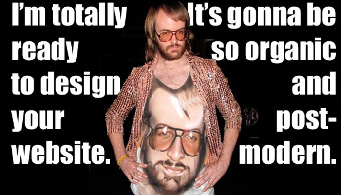
Otherwise, you’ll be at the mercy of some neck-beard hipster “creative” who will attempt to make your marketing piece unnecessarily pretty, all in the name of “creativity”.
Someone who’s only agenda is to create a piece of “awesome” design, or a beautiful monstrosity that “builds your brand online”.
But not one that actually sells anything.
So consider this book your own guardian angel against such douchebags.
It deals not in opinions, but hard facts gleamed from 9 years of hardnosed research and testing at the coalface of legibility, readability and comprehension.
It explains how layout can either enhance or destroy comprehension, and just how other elements of a design like the use of reverse type, colours, fonts, alignment and point size determine whether your piece actually gets read or not.
Wheildon details how to put all these disparate elements together to create a design layout that lends itself to maximum response, ensuring you give your design the best chance at maximising sales.
Of course, all this is predicated upon a design that has done its homework on its market, and has crafted a compelling message to resonate with that particular market.
But you knew that anyways, didn’t you?
Of course you did..
“Type & Layout: Are You Communicating or Just Making Pretty Shapes” , by Colin Wheildon, on Amazon.
Stay Hungry,
Keith “Your Guardian Angel” Commins
P.S. Next up we’re back hitting the copywriting trail for another book on the subject, and it was a tough call to include tomorrows tome over David Ogilvy’s “On Advertising”.
While Ogilvy’s work is undoubtedly a seminal book on the advertising biz, from the point of view of what might be of benefit to you, I’ve plumped for tomorrows book because of the timeless copywriting wisdom it contains.
I’ll catch you tomorrow to give you the lowdown.

